
Wardley Maps – an introduction
Why Wardley Maps are worth your time
When strategy goes wrong, it rarely fails because people lack talent. It fails because teams rush into execution without a shared understanding of what they are building, for whom, and why.
Wardley Maps are a deceptively simple tool that helps prevent exactly that. They create a shared, visual language that connects customer value, the components required to deliver that value, and how those components evolve over time – from novel and uncertain to standardized and commodity.
Used well, Wardley Maps help align leadership and execution, business and IT, innovation and operations.
What is a Wardley Map?
Wikipedia describes it like this:
> “A Wardley map is a map of the structure of a business or service, mapping the components needed to serve the customer or user.”* Wardley Maps are named after Simon Wardley, who developed the technique at Fotango (mid-2000s).
In practice, a Wardley Map is a picture of:
- A value chain (what the user needs, and what enables it)
- An evolution axis (how mature/commoditized each component is)
That combination is what makes the method powerful: it links strategy to reality.
Within the map, we measure customer value, often in layers that represents IT services. But it might as well be a service provided via a call centre or logistics.
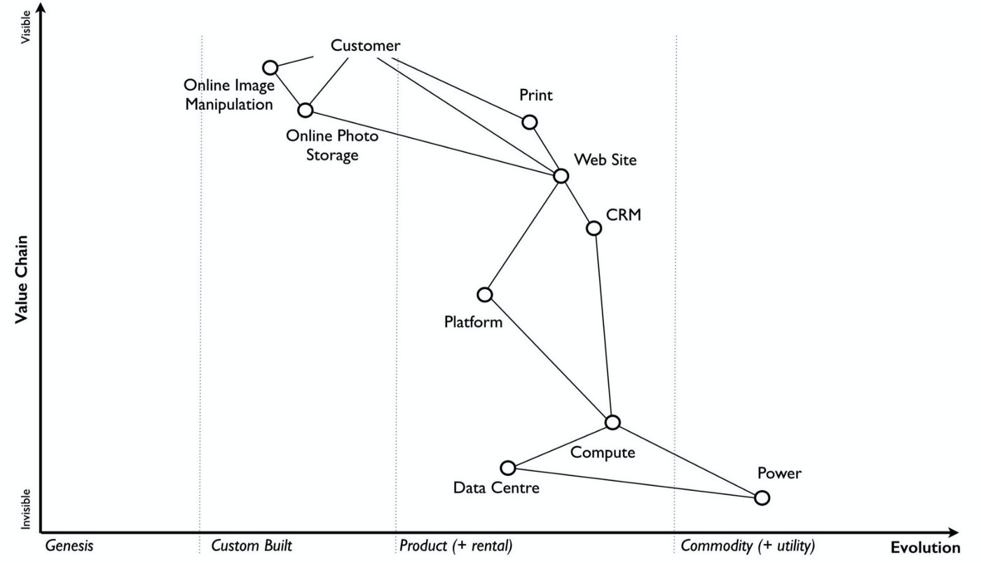
Below you see one of Simon’s own examples, taken from his page atmedium.com. The exact link is at the reference section at the end of the article.
Disclaimer: Below pictures are also taken from Simon’s article.
Bridging Innovation and Stability: Why Wardley Maps Matter
Every organization lives with a built‑in tension.
On one side are innovation‑oriented roles: people motivated to explore, experiment, and challenge the status quo. They are rewarded for ideas, speed, and potential disruption.
On the other side are stability‑oriented roles: people responsible for running today’s business. They protect reliability, margins, compliance, and customer trust. Their success is measured in uptime, predictability, and efficiency.
Both perspectives are essential. And both often talk past each other.
Investing in innovation only makes sense if it can eventually become a powerhouse—something that integrates into, or reshapes, the existing business. That requires alignment of motivations, incentive models, and KPIs across these two worlds.
This is where Wardley Maps earn their value.
By placing innovation, existing systems, and customer value into a single visual context, Wardley Maps turn abstract disagreements into concrete dialogue. They help teams discuss where differentiation makes sense, where standardization is beneficial, and how innovation can evolve without destabilizing what already works.
Wardley Maps do not eliminate tension between innovation and operations—but they make it productive.
A quick detour: Why misunderstanding is so expensive
A recurring pattern in organizations is the urge to delegate fast and execute early – often on vague plans. The result is familiar:
- Large programs start without real clarity -teams optimize locally and lose the biggerr picture
- Experts retreat into their domains (for survival or because incentives encourage it)
Interdisciplinary planning feels slow at the beginning – but it typically saves time and money later. It reduces rework, improves prioritization, and produces solutions that fit reality.
For me personally, working closely with UX and agile experts was a turning point. It changed how I scoped work: fewer “handovers,” more joint workshops, more shared language early—and as a result, less friction later.
How to choose a useful framework
Tools used to align and plan should be:
- easy to understand (low barrier to entry)
- powerful (able to surface real trade-offs)
- purpose-driven (clear outcomes)
- effective (improves decisions and execution)
Most importantly, the tool must match the **right level of abstraction** for the group in the room. That’s where Wardley Maps are valueable.
The core idea: Map the value chain and its evolution
A Wardley map contains and visualises two dimensions:
1) Vertical axis: the value chain
Start with the user (or customer). Then map the components needed to meet that user need. Components depend on other components, forming a chain (often layered).
This is not limited to software. It can include:
- services provided through call centers
- logistics and operational processes
- data, systems, and teams
2) Horizontal axis: evolution / commoditization
Each component sits somewhere on a spectrum—from novel and uncertain to standardized and commodity.
This axis is where strategy becomes visible.
Because once you see a component’s maturity, you can ask:
- Should we differentiate here, or is this a commodity?
- Are we investing in something that the market will standardize anyway?
- Where should we build, buy, outsource, or consume as a service?
Why Wardley Maps help innovation become real
A common misunderstanding about innovation is that it must be isolated: a special team, separate tooling, separate culture.
But innovation only matters if it integrates into (or reshapes) the existing business model. Otherwise it stays a slide deck.
Wardley Maps help because they create dialogue between two necessary mindsets:
- innovation-oriented roles (exploring new opportunities)
- stability-oriented roles (operating today’s cash-generating systems)
Both are right. Both are needed. The conflict is often not about intelligence—it’s about incentives, risk tolerance, and time horizons.
Wardley Maps don’t magically resolve that tension. But they make it discussable.
More than a snapshot: Analysis and planning
Wardley Maps are useful in two modes:
- Status quo mapping: What do we actually depend on to deliver value today?
- Strategic planning: Where should we standardize, industrialize, or differentiate next?
Because the map links user value to component maturity, it helps teams:
- identify where flexibility is required
- identify where standardization reduces cost and risk
- make trade-offs explicit under real constraints (time, budget, skills)
Analysis & status quo versus planning
Wardley Maps address this challenge and they furthermore support analytical decisions on where to differentiate or standardise within or cross value chains.
At portfolio level, the effect is even stronger: you can align funding, cross-team priorities, and architecture evolution with fewer guesswork debates.
A cultural benefit that many leaders underestimate
Peter Drucker’s line is famous for a reason: “Culture eats strategy for breakfast.”
When leadership plans strategy in an interdisciplinary way – using a shared map – it sends a different signal:
- people and expertise are respected
- trade-offs are made transparently
- buy-in is built into the process
Yes, this work takes energy. But it creates alignment that accelerates execution later.
Further reading and workshop tools
If Wardley Maps sparked ideas, start with Simon Wardley’s writing:
-
- Simon Wardley on Medium: https://medium.com/wardleymaps/on-being-lost-2ef5f05eb1ec
- For virtual mapping workshops, collaborative whiteboards work well:
- Mural: https://www.mural.co
- Miro: https://miro.com
- Miro has a Wardley Map template you can use as a starting point: https://miro.com/templates/wardley-map/
The secret of architecture, culture & processes
We have set one key objectives in the section “Next-Gen Architecture, Culture & Processes”: To share, discuss and debate approaches that improve collaboration and value creation. Architecting complex and interwoven systems require an extreme high level of social and interdisciplinary competence.
As an architects you do not only need a great deal of knowledge. You need experience and personality to carry the tremendous responsibility. As being in control of projects seems to be rather unrealistic. A supporting, empathic attitude towards peers and stakeholders is key.
As we aim to support you, we will focus on the following areas: Share experiences, methodologies and approaches. Approaches that help you to improve collaboration and cross organisation alignment.
We hope to be relevant to you and your personal growth. But we’re also keen to learn from you!
Part of our Open Source DNA is, that we are keen on learning from each other.
Beginners guide to dialectics
My personal key concern is driven by a general, human manner: Misunderstanding due to rushing into execution.
Since ancient times, the art of dialectics was trained as a discipline to overcome this gap. They were trained to ensure precise and joint understanding of perceptions and terms used. They repeated and clarified in iterations, until they were sure to have a common understanding. This was a defined pre condition before discussing the subject itself.
Considering that, I wonder how much this is a total contradiction to our shared business experiences: A common pattern is to delegate responsibilities as fast as possible to other parties. Starting execution on vague and shallow plans. I guess that all of us suffered from and within expressive and risky programs. Initiatives that have been kicked off without thorough understanding of context and root cause analysis. And in consequences, experts focussed on their core expertise. Peers neglected responsibility for the greater context – for survival or due to ignorance?
Interdisciplinary collaboration saves money and time
It seems obvious: Interdisciplinary planning and collaboration returns efforts spent early. It pays back both from a time to market and budget perspective. The OpenSourcerers experienced better and more relevant solutions following those principles. But we all know that the initial dialog and planning is hard and complex. It needs empathy, tools and craftsmanship. Good scoping, architecture and execution depends on ongoing and initial discourse and stakeholder engagement.
My personal empathy for my stakeholders grew over the years, being responsible for development and delivering solutions. I learned to respect my stakeholders and co workers even more. Looking only at leadership or business side, they are facing constraints and issues I was not able to imagine.
I learned to understand that their domain of expertise was fast developing like mine. I acknowledge how much they are exposed to market changes early and harder with complex dependencies.
If I had only known good frameworks earlier
Hence, I also realised how important good frameworks are. How much experience and thoughtfulness is condensed in them. Picking the ones that suite a problem, align increases. Joint work leads to more relevant features and much better time to market. It is not just fun, in addition it saves on limited budgets and time available.
A boost in my own learning comes from collaboration with User Experience and Agile experts. They helped me to adopt my approaches:
For example my way to scope projects or contracts changed. My approach became more open and inclusive. I focused on joint understanding with stakeholders. As a result, we changed a negotiation situation frequently into workshops. In those, we evaluated or reassessed the purpose and objectives of the endeavour. We found and picked better options and discussed solutions on constraints. Additionally, it helped us to establish a joint language and thought model, early in the process. That change build trust, that helped throughout negotiation and execution phases.
How to identify promising frameworks
Tools or frameworks I use in workshops to align, understand, define, scope and plan projects or programs need to be easy to understand, powerful, serve a defined purpose and they need to be effective, and they need to serve effectiveness:
They need us to understand what the right things are to invest, and what are things we should not invest in. In other words: They need to help to lay down the strategy and to make its context and constraints clear.
There are many known frameworks and techniques to run workshops and effectively. But picking the right tool for the matching problem needs experience and thoughtfulness.
As stated above: To execute efficiently, you need a good alignment on all parties prior to its usage. The need to understand why efforts are spend in an approach, and what results to expect. This is a key pre requisite you are responsible for, to ensure buy in and to support a frictionless execution. Furthermore, ensure to pick a framework that has a matching level of abstraction, understood by all, and to create relevant insights to proceed with next steps.
A simple but powerful approach – WARDLEY MAPS
With that intention, we start with a simple but powerful approach: “Wardley Maps”, as introduced by Simon Wardley.
The concepts and the power behind Wardley Maps is rich and profound. I want to encourage you to dive into Simon’s thinking, and his journey in his article on medium.com. I’ve put a reference at the end of that article.
Let’s have a look at an example from the field
Below you see one of Simon’s own examples, taken from his page at medium.com. The exact link is at the reference section at the end of the article.
Consider the dimensions we are building the coordinates from:
On the vertical axis, we draft the value chain, starting usually with a user or customer – the receiver of the value created.
And on the horizontal dimension we evaluate the grade of commoditisation.
Within the map, we measure customer value, often in layers that represents IT services. But it might as well be a service provided via a call centre or logistics.
Disclaimer: Below pictures are also taken from Simon’s article.
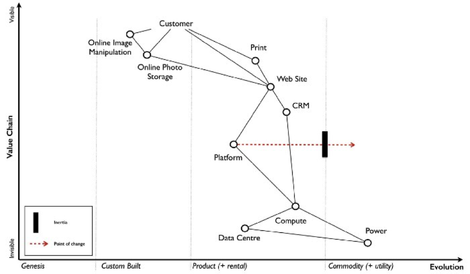
Context and value of the approach
What you cannot see in map is its context, why this value chain, this service or offering has been chosen on one hand. And on the other hand you miss the paramount purpose and structure of the organisation, what the considered market potential is, and so on.
For me, Wardley Maps are a powerful tool at planning a strategy or refactoring of a value chain. That is, because if we link each step in a value chain together with its ideal level of commoditisation is providing deep insight. And it is yet a pragmatic view, that opens a perspective on market differentiation. Whilst we plan to optimise customer value, it supports understanding of where we need to cope with legacy structures and systems present.
How to create innovations that provides tangible value
The idea behind Wardley Maps suggests clearly that an interdisciplinary team is needed to address those aspects: Customer value, customer experience, business execution and development / operations view.
It also overcomes a widespread view, that market differentiation should happen with brand new products or offerings. We thought, that innovation and new services’ source are special. That innovation needs focused teams, that worked somehow isolated.
But that approach ignores that innovation and differentiation need to integrate in existing, established business models or build upon them – and need acceptance by the people running those.
This is another key motivation to get kicked with Wardley Maps: It helps to align the mind sets and fosters dialogue between innovative mind sets and stability oriented ones. Let me make my point by exaggerating and oversimplify:
We all are aware of leadership driven innovation initiatives. They are often exec sponsored initiatives as an answer to the fear. The fear of being disrupted. Teams are smart, witty and use exciting tools to understand and analyse user needs and market trends.
But ideas and insights often fail to deliver against expectations and are getting ignored by parties that run the current businesses.
Why you need the best from two worlds
Lets consider innovation vs. the stability oriented roles. Build on the clichés we all have likely in mind. Consider what motivates those parties, how intrinsic motivation and incentives differ for people to come up with crazy sounding ideas and some one who is running such a large, cash cow business model supporting powerhouse.
I am convinced: Invest in innovation makes only sense if it becomes a powerhouse some day. And hence we need to align those motivations, incentive models, KPIs used to measure success.
And Wardley Maps help us to achieve this via dialogue!
Analysis & status quo versus planning
Wardley Maps address this challenge: Wardley Maps are not only used to capture and analyse a status quo. They furthermore support analyse decisions on where to differentiate or standardise within or cross value chains.
It supports you and your team: Where do you need to optimise the value chain by becoming more flexible or standardised. On each step you can go through efforts, time and resources needed, and helps you to make efficient trade offs within your given constraints.
How to achieve exponential improvements
The results of optimising your business and brand value are even greater at a portfolio level. It supports to align efforts, cross department funding and planning and so on.
Another aspect is addressing Peter Drucker’s concern: “Culture eats strategy for breakfast”.
If leadership choses to plan the strategy in such an interdisciplinary and collaborative way, it takes culture first: It embraces the people, appreciates their experience, opinions. If also fosters interdisciplinary discourse between staff member and managers, and hence has a relevant impact on culture.
And the value and impact of the resulting strategy has a built in buy in and a broad, powerful alliance in your org.
Yes, it is hard work. It needs empathy, energy and time to achieve a joint understanding. It might take a while to enfold its full flavour of positive results. But it will make a difference for your brand, organisation and your people.
Further reading, virtual workshop tools & references
I hope that Wardley Maps got your attention, triggered ideas on how and where to use them. Furthermore, I want to encourage you to read Simon’s story on why he came up with this framework and approach. If you are an agile oriented IT guy, you will see many familiar thoughts, patterns and concepts in his book:
Simon Wardley on Wardley Maps on medium.com: https://medium.com/wardleymaps/on-being-lost-2ef5f05eb1ec
Tools that can be used as whiteboards and collaborative workspaces for virtual workshops:
Miro and Mural are very comparable from a feature set, both worked well for me with typical group sizes from 2-40 plus active attendees. My company provides miro as our standard tool.
For both tools, you can find prepared templates to play with or adopt, like this one: https://miro.com/templates/wardley-map/